Component D
Data Usability and Analysis
Implementation Steps
D.1 Data Exploration and Visualization
Data Exploration and Visualization is defined here as the presentation and/or manipulation of data in a graphical form to facilitate understanding and communication. The process of improving exploration and visualization capabilities begins by identifying the questions that the agency would like to answer. Once this is done, gaps in data and analysis can be assessed, and improvements can be designed.
- Understand requirements
- Assess data usability
- Design and develop data views
“You can have data without information, but you cannot have information without data.”
Source: Daniel Keyes Moran, Programmer
“Above all else, show the data.”
Source: Edward R. Tufte, Data Visualization Thought Leader
Step D.1.1 Understand Requirements
To assess data usability, agency staff must first identify what questions need to be answered, and what data sources are needed to address these questions. Once this is done, the agency can evaluate data adequacy and define data exploration and visualization requirements. While the specific questions will depend on the performance area, the following types of questions will generally be applicable:
- What is the current level of performance?
- How does it vary across types of related measures (pavement roughness, rutting, cracking)?
- How does it vary across transportation system subsets (district, jurisdiction, functional class, ownership, corridor)?
- How does it vary by class of traveler (mode, vehicle type, trip type, age category)?
- How does it vary by season, time of day, or day of the week?
- Is observed performance representative of “typical” conditions or related to unusual events or circumstances (storm events or holidays)?
- How does performance compare with peers and the nation as a whole?
- How does current performance compare with past trends?
- Are things stable, improving, or getting worse?
- Is current performance part of a regularly-occurring cycle?
- What factors have contributed to the current performance?
- What factors can the agency influence (hazardous curves, bottlenecks, pavement mix types)?
- How do changes in performance relate to general socio-economic or travel trends (economic downturn, aging population, lower fuel prices contributing to increase in driving)?
- How effective have past actions to improve performance been (safety improvements, asset preventive maintenance programs, incident response improvement)?
Based on these questions, agencies can create a chart similar to that in Table D-7 to identify data sources and understand analysis requirements. Because agencies typically will not have all desired data, it is helpful to prioritize requirements to begin rolling out basic data exploration and visualization capabilities and have a plan for future expansion of these capabilities.
Examples
Auto Report Generator: Utah Department of Transportation2
Utah DOT’s Auto Generator allows users to enter project limits on a straight-line diagram and generate a spreadsheet that can be used to prepare an engineer’s estimate. This is an example of building a tool that presents existing data (asset data collected via LiDAR) in a form that is immediately useful for addressing a specific business question: what is the cost of replacing existing assets within a given location? The summary spreadsheet provides data related to pavements, pavement markings, barriers, and signs. Engineers can then use this information to verify measurements and other details (e.g., sign damage, non-standard barriers) in the field.
Source: Utah Department of Transportation3
| Question | Data Elements | Coverage | Granularity |
|---|---|---|---|
| How does the current level of highway safety performance compare with past trends? | Fatality Rate–based on number of highway fatalities and vehicle miles of travel |
Spatial: All public roads statewide Temporal: 1995-2015 |
Spatial: by road class and jurisdiction Temporal: Annual Other: Age Category |
| What factors have contributed to the current level of performance? |
Crash record attributes (first harmful event, etc.) Road inventory attributes Emergency Medical Response Attributes |
Linkage to crash records to provide same coverage as dependent variable (fatality rate) | Linkage to crash records to provide same granularity as dependent variable (fatality rate) |
Linkages to Other TPM Components
- Component 02: Target Setting
- Component 03: Performance-Based Planning
- Component 04: Performance-Based Programming
- Component 05: Monitoring and Adjustment
- Component 06: Reporting and Communication
- Component B: External Collaboration and Coordination
Step D.1.2 Assess data usability
Once data requirements are identified, the next step is to examine the available data and determine its usability.
Questions to ask in assessing data usability include:
- Are relevant data available, i.e., that can provide answers to the applicable questions?
- Are the data of sufficient quality for the purpose–are they sufficiently accurate, complete, consistent and current?
- Do the data have sufficient coverage to meet business needs–both spatially and temporally?
- Are the data available at the right level of granularity to meet business needs?
- Where multiple overlapping sources of data are available, is it clear which is authoritative?
Inevitably there will be gaps in the existing data. Some gaps can be filled through new data collection or acquisition initiatives. Because acquisition of new data comes at a cost, it is necessary to consider the value that the new data would bring and whether existing data could suffice.
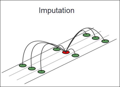
Other gaps will not be possible to fill through acquisition of new data–for example, a trend data set might be missing data for certain years, or historical data may be based on a different measurement method than current data. These types of gaps need to be addressed on a case-by-case basis. In some cases, imputation methodologies can be used to fill in missing data. In addition, data transformation methods can be applied to convert across measures (where statistically reliable relationships can be established). In other cases, the agency can decide to just live with the missing data.
Examples
Crash Data Quality Assessment
The University of Massachusetts UMassSafe program, with participation from the Massachusetts Traffic Records Coordinating Committee (TRCC) conducted an audit of data quality issues in the Massachusetts Crash Data System (CDS).
Key issues discovered included:
- High rate of missing injury severity data: injury severity is missing for approximately 25% of cases.
- Poor location information: location information collected on the crash form varies greatly.
- Poor data quality for engineering-related fields: while injury severity is perhaps the most substantial field with a high percentage of missing information, there are other fields that share similar problems.4
Each of these types of errors impacts usability of data for tracking highway safety performance. Missing injury severity data impacts the ability to meaningfully track serious injuries. Poor location information impacts ability to summarize the data by geographic area and to visualize the data on a map. Poor quality data for other crash record fields impacts the ability to understand causal factors.
Figure D-3: Imputation Model
Source: Transportation Research Board5
Traffic Speed Data—Addressing Missing Values
Travel time data sets based on vehicles acting as “probes” may have missing values for certain locations and time periods due to gaps in traffic at that place and time. Imputation methods are used by vendors of these data sets to fill in these missing values based on the surrounding data.6
Linkages to Other TPM Components
Step D.1.3 Design and develop data views
After relevant data has been compiled, capabilities for data exploration and visualization can be designed and developed. Data exploration and visualization techniques take sets of individual data records and transform them into a form that facilitates interpretation and analysis. The design of these capabilities should be based on the requirements identified in step D.1.1.
Common data exploration techniques include:
- Grouping: organizing data into categories for analysis (e.g., corridors or districts)
- Filtering: looking at a subset of the data meeting a specified set of criteria (e.g., run off the road crashes on rural roads involving fatalities)
- Sorting: ordering data records based on a specified set of criteria (e.g., sort transit routes by daily ridership)
- Aggregating: summarizing groups of records by calculating sums, averages, weighted averages, or minimum or maximum values (e.g., calculating the length-weighted average pavement condition index for Interstate highways in District 1)
- Disaggregating: viewing individual records that comprise a data subset (e.g., view the individual projects for the current fiscal year that are not on time or on budget)
Pivot tables and increasingly sophisticated data analysis features in desktop spreadsheet software can perform many of these functions, as can various other commercially available reporting and business intelligence tools. For some types of visualizations, specialized software development may be required. Work may be needed to prepare the data so that it utilizes common, consistent categories and includes valid data for elements that will be used for grouping, filtering sorting and aggregating.
Common data visualizations include
- Charts that summarize current performance, trend lines and peer comparisons– these may be bar (simple, stacked, or clustered), line, and pie charts, scatter or bubble charts, bullet graphs, histograms, radar charts, tree maps, heat maps, or combinations.
- Maps that show performance by location or network segment, or allow for examination of detailed information such as condition of individual assets or characteristics of individual crashes. Maps are a useful tool for integrating multiple data sets with a spatial component in order to better understand results. They are also useful for communicating performance information to both internal and external audiences.
- Dashboards that utilize a variety of charts to show high-level performance indicators. Dashboards may be interactive–enabling drill down from categories to sub-categories and individual records.
- Infographics developed to facilitate understanding of a specific performance area.
Some agencies have been able to leverage external resources for developing useful data visualizations. They make an open data feed available, and encourage app developers to present the data in useful forms (e.g., interactive maps).
Examples
Sample Visualizations from Washington State DOT
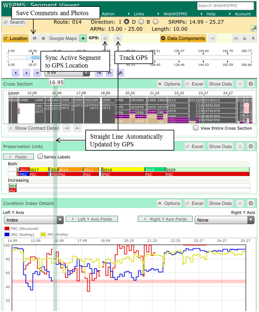
Washington State DOT’s Gray Notebook provides several examples of effective data visualizations. The donut chart displayed in Figure D-4 demonstrates the relative magnitudes of different reasons for canceling ferry trips. The stamp graphs in Figure D-5 depict differences in congestion, both temporally (by period of the day, and by year) and geographically. The spiral graph in Figure D-6 shows where and when delay is greatest along a corridor. A fourth image shown in Figure D-7 from WSDOT (but not from the Gray Notebook) shows a screenshot of a tool that can be used in the field to review and validate different components of the pavement condition index along a specified road segment.
Figure D-4: WSDOT Data Visualization Example 1
Source: The Gray Notebook Volume 587
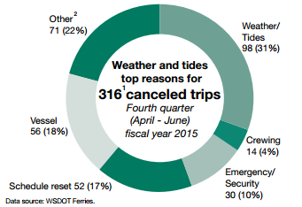
Figure D-5: WSDOT Data Visualization Example 2
Source: The 2014 Corridor Capacity Report Appendix8
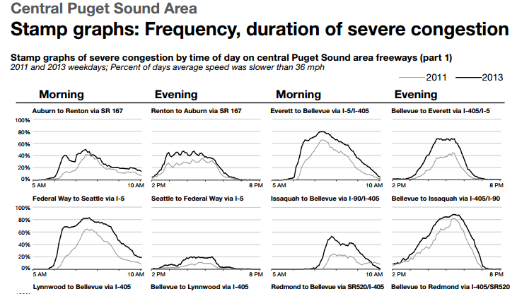
Figure D-6: WSDOT Data Visualization Example 3
Source: The 2014 Corridor Capacity Report Appendix9
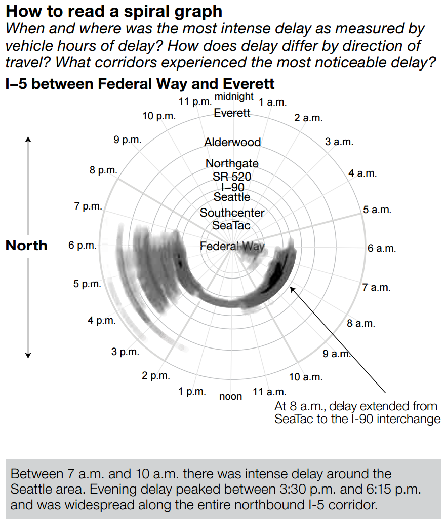
Figure D-7: WSDOT Data Visualization Example 4
Source: Visualizing Pavement Management Data10
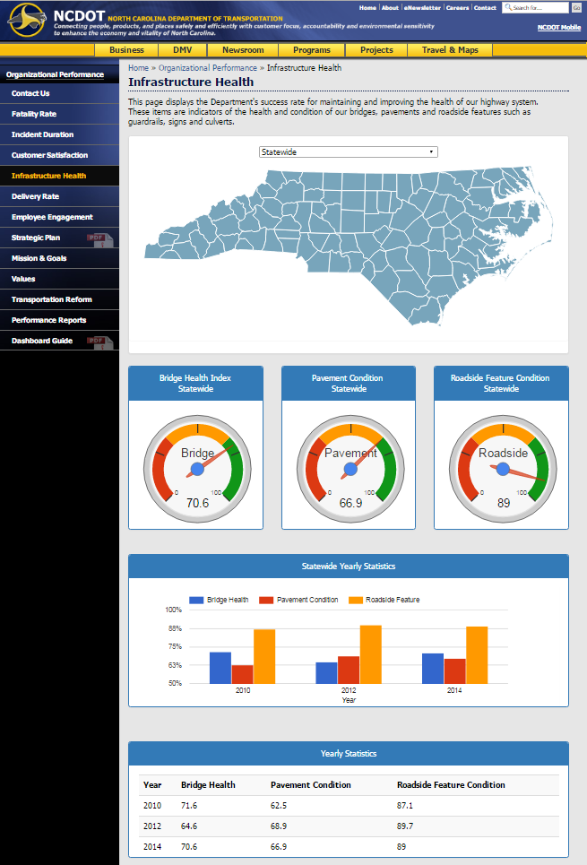
Organizational Performance: North Carolina Department of Transportation11
North Carolina DOT allows users to quickly compare performance statewide or for specific counties on its website. The example below demonstrates infrastructure health statistics (bridge health index, pavement condition, and roadside feature condition) at the statewide level, but the clickable map allows users to easily explore performance across counties. The data view also displays historical data at the annual level.
Figure D-8: NCDOT Performance Data for Public Consumption
Source: Infrastructure Health12
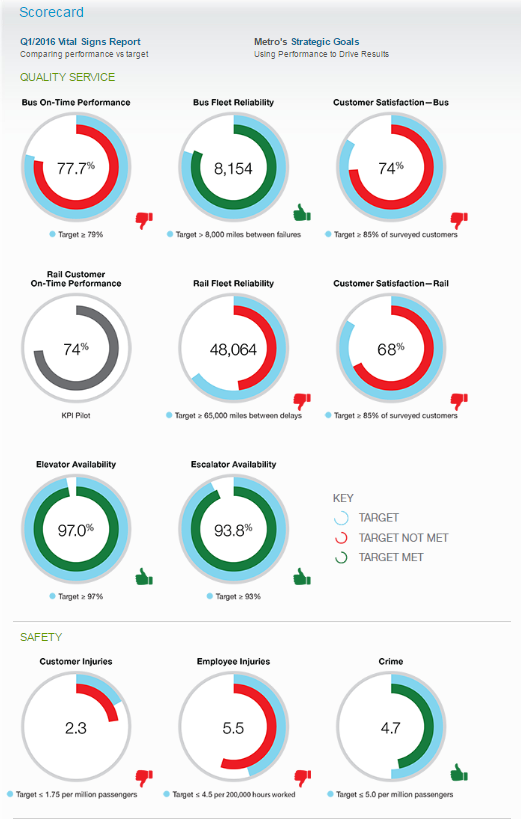
Performance Scorecard: Washington Metropolitan Area Transit Authority13
Washington Metropolitan Area Transit Authority (WMATA)’s Scorecard dashboard shows high-level performance indicators across a number of categories, displaying a total of 14 performance measures related to service quality, safety, and people and assets. The dashboard displays WMATA’s performance in the given period along with the target performance for the period. Indicators are color-coded in green and red so that it is instantly clear to the user whether WMATA met its target for each performance indicator. An accompanying “Vital Signs Report” is available that provides further details on each of the performance indicators, including historical performance, reasons for historical change, and key actions to improve performance.
Figure D-9: WMATA Scorecard Dashboard
Source: WMATA14
37 Billion Mile Data Challenge: Massachusetts Department of Transportation, Metropolitan Area Planning Council, and Massachusetts Technology Collaborative15
MassDOT, the Metropolitan Area Planning Council (MAPC), and the Massachusetts Technology Collaborative (MassTech) collaborated to hold a data challenge where the agencies provided the public with vehicle census data and asked the public to provide policy insights. The vehicle census data was produced using anonymized State Vehicle Registry data, and included data on vehicle characteristics, annual mileage, and aggregate spatial data. The data challenge encouraged participants to consider specific questions, such as, “What factors make a neighborhood more likely to have high car ownership and mileage,” and “Where might investments in walking, biking and transit have the biggest impact in reducing how much people drive”? Award-winning entries included a split-screen mapping tool comparing any two of a set of emissions metrics, visualization tools made available to other entrants, and an infographic on driving facts.
Linkages to Other TPM Components
D.2 Performance Diagnostics
The following subcomponent outlines implementation steps for agencies to develop performance diagnostics capabilities. This process allows an agency to examine performance changes and understand how factors affected performance.
- Compile supporting data
- Integrate diagnostics into analysis and reporting processes
“All truths are easy to understand once they are discovered; the point is to discover them.”
Source: Galileo Galilei
Step D.2.1 Compile supporting data
The steps described above for subcomponent D.1 should result in identification of additional data that would be helpful for root cause analysis.
Much of the data needed for performance diagnostics will already be compiled as part of agency planning and performance data gathering activities (see Component C: Data Management ). However, it may or may not be in a form that is useful for analysis. For example, crash records will typically contain a wealth of information for understanding causal factors. However, linking road inventory or incident data to the crash records requires additional effort. In some instances agencies will find that they need to undertake data quality improvement efforts to ensure consistent spatial referencing across crash and inventory data sets, and to ensure that inventory data are available that match the specific time of the crash.
It will be important to distinguish causal factors that are within the agency’s control from those that are external. While both types of factors should be considered in developing predictive capabilities, agencies will gain the most value through identifying things that they can do to “move the performance needle.”
Examples
Examples of explanatory variables for each of the TPM performance areas are identified below. To diagnose performance in each TPM area, it would be necessary to compile data on some or all of the explanatory variables.
Source: Federal Highway Administration
| TPM Area | Explanatory Variables |
|---|---|
| General | Socio-economic and travel trends |
| Bridge Condition | Structure type and design Structure age Structure maintenance history Waterway adequacy Traffic loading Environment (e.g., salt spray exposure) |
| Pavement Condition | Pavement type and design Pavement age Pavement maintenance history Environmental factors (e.g., freeze-thaw cycles) Traffic loading |
| Safety | Socio-economic and land use factors (e.g., population and population density, age distribution, degree of urbanization) Traffic volume and vehicle type mix Weather (e.g., slippery surface, poor visibility) Enforcement Activities (e.g., seat belts, speeding) Roadway capacity and geometrics (e.g., curves, shoulder drop off) Safety hardware (barriers, signage, lighting, etc.) Speed limits Availability of emergency medical facilities and services |
| Air Quality | Stationary source emissions Weather patterns Land use/density Modal split Automobile occupancy Traffic volumes Travel speeds Vehicle fleet characteristics Vehicle emissions standards Vehicle inspection programs |
| Freight | Business climate/growth patterns Modal options–cost, travel time, reliability Intermodal facilities Shipment patterns/commodity flows Border crossings State regulations Global trends (e.g., containerization) |
| System Performance | Capacity Alternative routes and modes Traveler information Signal operations/traffic management systems Demand patterns Incidents Special events |
Linkages to Other TPM Components
- Component 06: Reporting and Communication
- Component A: Organization and Culture
- Component C: Data Management
Step D.2.2 Integrate diagnostics into analysis and reporting processes
Once data are compiled that can provide diagnostic information (see Component C, Data Management), the data must be integrated into the agency’s analysis and reporting tools and processes.
Several different approaches to integration can be considered, depending on the nature of the data:
- Direct linkage to the elemental unit of performance–enabling the analyst to “slice and dice” data by causal factors or conduct statistical analysis. Using this method, a value associated with the causal factor is associated with each elemental performance record (e.g., pavement section, bridge, crash, system performance location/time slice, etc.)
- Trend data overlays–enabling the analyst to view trend information for the causal factor together with the primary performance trend (e.g., show VMT growth in a corridor along with changes in average speed)
- Spatial overlays–enabling the analyst to view data for geographic areas or network links for the causal factors as an overlay on the primary performance data (e.g., overlay climate zones on a map of pavement deterioration)
High level consideration–separate trend or pattern investigation for the causal factor that assists the analyst to draw conclusions about the primary performance data (e.g., understanding shifts in patterns of global trade for understanding changes in freight flows)
Each of these approaches implies different processes for data preparation. The direct linkage approach can require a data conversion or mapping exercise where the causal data set has been independently assembled, and identifiers for location, time, event, or asset are not consistent with those used for the primary performance data set.
The trend data overlay approach requires that the causal data set and the primary performance data sets cover the same time frame (or overlap sufficiently to provide for meaningful trend comparison). If time units vary (e.g., fiscal versus calendar years), some degree of conversion may be needed.
The spatial overlay approach requires at a minimum that both data sets have spatial referencing that can be utilized within the agency’s available GIS. However, some level of data processing may be needed to display different data sets for the same set of zones or network sections. For example, if one data set has population by census tract and another has average pavement condition by district, both could be displayed on a map, but a data conversion process would be required to aggregate the census tract information to be displayed by district. Data standardization and integration is covered in more detail in Data Management (Component C).
Once an integration approach is selected and implemented, a repeatable process to support root cause analysis on an ongoing basis can be implemented. This will require effort, but can save future analysts from having to “reinvent the wheel” later on. The results can take the form of automatically generated views, which can be made available to a wider audience beyond the primary data analyst. Regularly obtaining feedback on the value of the data diagnostic views can result in continued improvements.
Examples
Minnesota Strategic Highway Safety Plan: Focus Area Priorities16
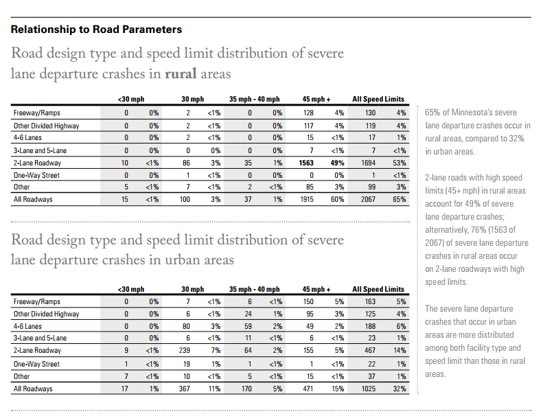
The Minnesota Strategic Highway Safety Plan 2014-2019 was intended to reduce traffic-related crashes. It presents a set of focus areas with strategies for improving statewide road safety.
In selecting safety strategies, the state begins by reviewing crash data and analyzing for frequency, patterns, and trends across the focus areas, regions, roadway types, and conditions. As a result, diagnostics are integrated into reporting through the Strategic Highway Safety Plan, and impact the selection of strategies to effect change in future performance. For example, the state combined crash data with road design data to determine if road design had any explanatory power in lane departure crashes, and found that rural two-lane roads with high speed limits account for 49% of severe lane departure crashes. This information is useful for development of key strategies such as: “Provide buffer space between opposite travel directions,” and “Provide wider shoulders, enhanced pavement markings and chevrons for high-risk curves.”
Figure D-10: MnDOT Investment Prioritization
Source: Minnesota Strategic Highway Safety Plan17
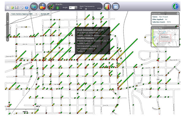
Minnesota DOT: Crash Mapping Analysis Tool18
Minnesota DOT also created the Minnesota Crash Mapping Analysis Tool (MnCMAT), which allows approved users to visually examine data compiled and integrated from multiple sources through a GIS-based mapping tool. The MnCMAT has drill down and selection capabilities, and can create various outputs.
The basic analysis process consists of:
- Selecting the area to be analyzed
- Applying filtering criteria (e.g., location, contributing factor, time period, crash severity, crash diagram, driver information, road design, speed limit, system class, surface conditions, weather, type of crash, number of fatalities, number of vehicles)
- Generating output in the form of maps, charts, reports, and date files
Figure D-11: MnDOT Crash Mapping Analysis Tool
Source: Minnesota Crash Mapping Analysis Tool – MnCMAT Material PowerPoint19
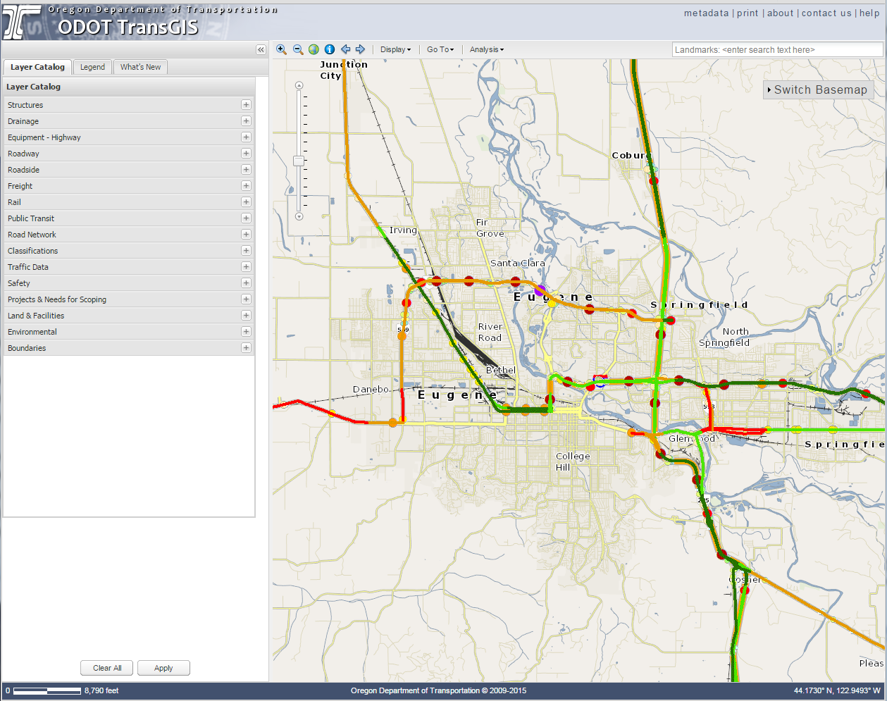
Oregon DOT: TransGIS20
Oregon DOT’s TransGIS web mapping application integrates a variety of data into a user-friendly GIS interface. This enhances the ability for ODOT staff and other users to overlay different data layers to explore and analyze data interrelationships.
Figure D-12: OregonDOT Web Mapping and GIS Integration
Source: ODOT21
Linkages to Other TPM Components
D.3 Predictive Capabilities
Predictive capabilities enable agencies to anticipate future performance and emerging trends. The following section outlines implementation steps for agencies to develop predictive capabilities. Agencies must first establish a methodology for predicting future performance, then evaluate, acquire, and configure analysis tools to support that methodology. Continual review and improvement of tools is an important and ongoing activity.
- Understand requirements
- Identify and select tools
- Implement and enhance capabilities
“The reality about transportation is that it’s future-oriented. If we’re planning for what we have, we’re behind the curve.”
Source: Anthony Foxx, U.S. Secretary of Transportation
“The most reliable way to forecast the future is to try to understand the present.”
Source: John Naisbitt, Author of Megatrends
Step D.3.1 Understand Requirements
Predictive capabilities enable agencies to systematically analyze future performance given (1) implementation of performance improvement projects and programs, and (2) changes in other factors that the agency does not control. Performance predictions are useful for setting defensible future performance targets, for planning-level evaluation of the potential effectiveness of alternative strategies to improve performance, and for assessing likely performance impacts of alternative short and mid-range program bundles.
Performance predictions can be made at the system-wide, subnetwork, corridor, or facility level. Performance analysis methods can range in complexity–based on the number and type of factors considered, and the technical modeling approach used. A methodology that is intended for network-level predictions is not typically appropriate for site-specific applications.
Requirements for performance prediction capabilities can be established by clarifying how these capabilities will be used for target setting, planning, site-specific strategy development, and programming.
In general, predictive capabilities should:
- Allow agencies to analyze the “do nothing” scenario–to predict how performance would change if no improvements were implemented
- Allow agencies to estimate the potential impacts of individual strategies for performance improvement
- Allow agencies to predict how the value of a performance measure will change based on implementation of plans or programs
Ideally, predictive capabilities should allow for convenient testing of a variety of assumptions. A scenario analysis approach to prediction recognizes inherent uncertainties and ensures that recipients of the analysis understand these uncertainties.
Prior to establishing requirements, it is a good idea to do some research into the state of the practice in different areas for performance prediction (see step D.3.2). This can help to identify what is possible given available data and tools – and the level of effort required to implement and maintain a modeling capability.
Examples
Safety Performance Functions (SPF) have been developed as a simple method for predicting the average number of crashes per year at a location, as a function of exposure and site characteristics.
SPFs can be used in different contexts:
- Network Screening: Identify sites with potential for safety improvement by determining whether the observed safety performance is different from that which would be expected based on data from sites with similar characteristics.
- Countermeasure Comparison: Estimate the long-term expected crash frequency without any countermeasures and compare this to the expected frequency with a set of countermeasures under consideration.
SPFs can be calibrated to reflect specific locations and time periods. However, an agency may choose to use additional predictive tools to supplement or update SPFs.
For further information, see: https://safety.fhwa.dot.gov/tools/crf/resources/cmfs/pullsheet_spf.cfm
Crash Prediction Modeling: Utah Department of Transportation22
Utah DOT calibrated the Highway Safety Manual’s crash prediction models for statewide curved segments of rural two-lane two-way highways over three-year and five-year periods. The calibration used LiDAR data on highway characteristics in combination with historical crash data. The model incorporated safety performance functions, crash modification factors, and a jurisdictional calibration factor. Utah DOT developed this model to meet requirements for a predictive safety tool that accounts for local conditions and specific roadway attributes.
Linkages to Other TPM Components
- Component 02: Target Setting
- Component 03: Performance-Based Planning
- Component 04: Performance-Based Programming
- Component C: Data Management
Step D.3.2 Identify and select tools
A variety of tools are available for predicting performance. Some tools are simple and don’t require specialized software. Others are more complex and can be obtained from FTA, FHWA, peer agencies, or through purchase or licensing of software from commercial entities.
Prior to selection of any tool, agencies should conduct an evaluation that includes the following considerations:
- Match with agency business needs;
- Experience of other agencies with the tool (other client/user references);
- Availability of sufficient data to meet tool requirements;
- Ease of integration with existing systems that may supply inputs;
- Ease of integration with existing agency reporting and mapping tools;
- Availability of technical documentation describing methodology and assumptions;
- Availability of user documentation describing steps for tool application;
- The time and complexity of implementation;
- The ability to customize the tool to the agency, both during implementation and on an ongoing basis;
- Tool acquisition and support costs;
- Likelihood of ongoing support and upgrades; and
- Availability of internal staff resources to understand and productively make use of the tool.
In order to ensure that a tool under consideration meets agency requirements, a pilot application can be pursued. This provides an opportunity to test the tool’s capabilities with real data for a limited application.
Examples
Source: Federal Highway Administration
| TPM Area | Available Tools |
|---|---|
| Bridge Condition | Bridge Management Systems (commercial, AASHTOWare, and custom built) |
| Pavement Condition | Pavement Management Systems (commercial and custom built) |
| Safety | SafetyAnalyst IHDSM Crash Modification Factors See others at: https://safety.fhwa.dot.gov/tsp/fhwasa13033/appxb.cfm |
| System Performance and Freight | SHRP-2 TravelWorks Bundle Commercial and custom travel demand modeling tools: trip and activity-based (for person travel and freight movement) Traffic Simulation and Analysis Models (see: https://ops.fhwa.dot.gov/trafficanalysistools/) FHWA’s Freight Analysis Framework: forecasts Economic Input-Output Models: commercial and custom |
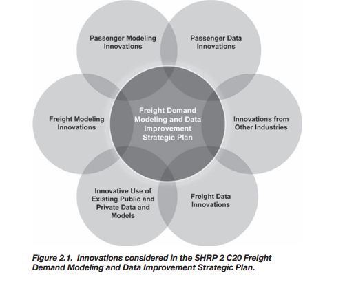
Freight Demand Modeling: Wisconsin DOT23,24
As part of the second Strategic Highway Research Program (SHRP2) Product C20 Implementation Assistance Program, Wisconsin DOT piloted a proof of concept to develop a hybridized model for freight demand, with the goal of integrating it with regional travel demand models in order to quantify the effects of different scenarios on freight transportation in the region. WisDOT is currently reviewing the modeling effort. Outside of the Wisconsin DOT example, the SHRP2 Product C20 as a whole built a strategic plan with a long-term set of strategic objectives for freight demand modeling and data innovation going forward.
Figure D-13: Integrating Freight Demand Modeling
Source: Transportation Research Board25
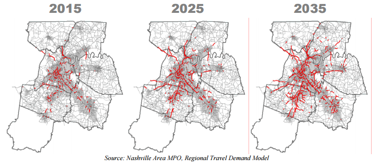
MPO Congestion Forecasting: Nashville Area MPO26
Like many MPOs, the Nashville Area MPO forecasts roadway congestion. The MPO uses a land use model as a tool to predict residential and employment distributions. It then uses a travel demand model as a tool to predict travel patterns. The congestion forecasts then use this travel demand model to identify congested routes in horizon years. The MPO notes that historically, Nashville regional congestion followed a radial commuting pattern into and out of downtown CBDs, but that recently congestion has also occurred near suburban commercial clusters (Regional Activity Centers) and in circumferential commuting patterns. This existing scenario serves as a foundation to forecasting future congestion.
Figure D-14: MPO Congestion Forecasting Visualization
Source: Nashville Area MPO27
Linkages to Other TPM Components
- Component 03: Performance-Based Planning
- Component 04: Performance-Based Programming
- Component 06: Reporting and Communication
- Component A: Organization and Culture
- Component C: Data Management
Step D.3.3 Implement and enhance capabilities
Once the selected predictive tools are in place, an agency can focus on implementing and enhancing its analysis–and integrating use of the tool within agency business processes. This may involve:
- Validating and improving model parameters and inputs. Over time, default values for model parameters can be validated and replaced with improved parameters that better match with actual agency experience.
- Utilizing the models to analyze risk factors that may impact achievement of strategic goals and objectives. This can be accomplished through scenario analysis that tests the impacts of varying assumptions.
- Communicating the value and the limitations of the tools to stakeholders to ensure proper use. Communicating the value can generate support for the tools and future enhancements, while communicating limitations can lead to an understanding of (and possibly support for) how the tool can be approved.
Examples
Pavement Management Analysis: Virginia DOT
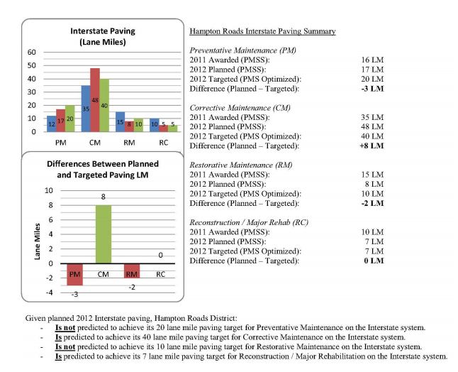
Virginia DOT uses a commercial Pavement Management System (PMS) to predict future network-level pavement performance as part of its annual maintenance and operations programming process. The agency sets pavement performance targets at the statewide and district levels. It uses its PMS, together with a companion pavement maintenance scheduling system (PMSS) tool to provide early warning of targets not being reached. This analysis is based on the status of planned paving projects, the most recent pavement condition assessments, and predicted pavement deterioration based on PMS performance models. The pavement management tools allow VDOT to use multi-constraint optimization to predict future needs and performance, and to inform agency business processes (e.g., budgeting and programming). The figure below illustrates one of the reports used to summarize planned versus targeted work by highway system class and treatment type.
Figure D-15: VDOT Comparative Pavement Analysis
Source: Virginia DOT28
Bridge Management System Enhancements: Florida DOT29
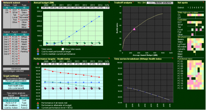
Florida DOT implemented the AASHTO Pontis Bridge Management System as part of an effort to improve its asset management information quality, and support decision-making at the network and project levels. Since its initial implementation, Florida DOT has made a number of customized enhancements, such as improving its deterioration and cost models, and implementing multi-objective optimization. Florida DOT uses the outputs of the bridge management system to forecast life cycle costs for planning of maintenance, repair, rehabilitation, and replacement work, and to forecast National Bridge Inventory bridge condition measures. This is helpful for resource allocation, as the software predicts bridge performance levels given different funding scenarios.
Figure D-16: FDOT Pontis Bridge Management System
Source: Florida Department of Transportation30